


文章均为个人原创, 搬运请附上原文地址感谢, 原文来自MasterYi博客
学习本篇前需掌握的知识基础
1. 例举适配方案
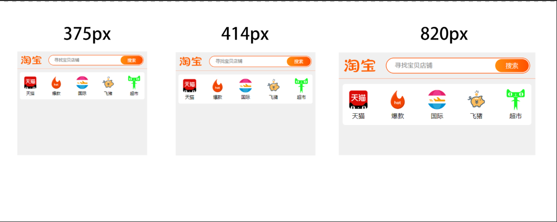
1.1 transform
- 实现的思路:通过控制body的宽作为页面宽,再通过js计算可视区域来设置 transform:scale 的缩放比来进行适配
- 优点:可以根据设计稿px来直接来进行编写,无论任何分辨率(超小屏,超大屏)也会自动适应大小1比1的还原设计稿,无需采用媒体查询写多套减少代码量
- 缺点:无法使用vw和vh
<!DOCTYPE html>
<html lang="en">
<head>
    <meta charset="UTF-8">
    <title>transform适配</title>
    <meta name="viewport" content="width=device-width,initial-scale=1,minimum-scale=1,maximum-scale=1,user-scalable=no,viewport-fit=cover">
</head>
<style>
     html { overflow: hidden;}
     * { box-sizing: border-box;}
     body { margin: 0; padding: 0; overflow-x: hidden; overflow-y: auto; transform-origin: left top; background: #f0f0f0; }
    .page { width: 750px;}

    .header { width: 750px; height: 100px; display: flex; padding: 20px; justify-content: space-between; border-bottom: 1px solid coral; }
    .header .logo { height: 60px; width: 120px; padding: 5px 0;}
    .header .logo img { width: 100%; height: 100%;}

    .header .search { width: 550px; position: relative;}
    .header .search input { width: 100%; height: 60px; font-size: 24px; border-radius: 40px; border: #FF5000 2px solid; text-indent: 30px;}
    .header .search div { background: linear-gradient(to right, #FF8D0E, #FF5000); color: #fff; border-radius: 32px; width: 128px; height: 50px; position: absolute; right: 5px; top: 5px; text-align: center; line-height: 50px; font-size: 24px;}

    .list { display: flex; justify-content: space-between; width: 720px; margin:20px auto; padding: 20px; background: #fff; border-radius: 10px;}
    .list .item { width: 80px; text-align: center; font-size: 24px;}
    .list .item img { width: 80px; height: 80px;}
</style>
<body>
<div class="page">
    <div class="header">
        <div class="logo">
           <img src="https://gw.alicdn.com/imgextra/i4/O1CN019XWXNq1aAPOVMYSiu_!!6000000003289-2-tps-167-63.png" />
        </div>
        <div class="search">
           <input placeholder="寻找宝贝店铺" />
           <div>搜索</div>
        </div>
    </div>
    <div class="list">
        <div class="item">
            <img src="https://masteryi-localhost.oss-cn-hangzhou.aliyuncs.com/blog/article/9/1.png" />
            <span>天猫</span>
        </div>
        <div class="item">
            <img src="https://masteryi-localhost.oss-cn-hangzhou.aliyuncs.com/blog/article/9/2.png" />
            <span>爆款</span>
        </div>
        <div class="item">
            <img src="https://masteryi-localhost.oss-cn-hangzhou.aliyuncs.com/blog/article/9/3.png" />
            <span>国际</span>
        </div>
        <div class="item">
            <img src="https://masteryi-localhost.oss-cn-hangzhou.aliyuncs.com/blog/article/9/4.png" />
            <span>飞猪</span>
        </div>
        <div class="item">
            <img src="https://masteryi-localhost.oss-cn-hangzhou.aliyuncs.com/blog/article/9/5.png" />
            <span>超市</span>
        </div>
    </div>
</div>
</body>
<script>
/**
 * @effect 自动适配
 * @param {number} width 设定满屏宽度
 */
function adapterFc(width){
    let render = () => {
        document.body.style.width = `${width}px`;
        document.body.style.height = document.documentElement.clientHeight / (document.documentElement.clientWidth / width) + 'px';
        document.body.style.transform = `scale(${document.documentElement.clientWidth / width})`;
    }
    render();
    window.onresize = () => render()
}
adapterFc(750);
</script>
</html>
1.2 弹性布局
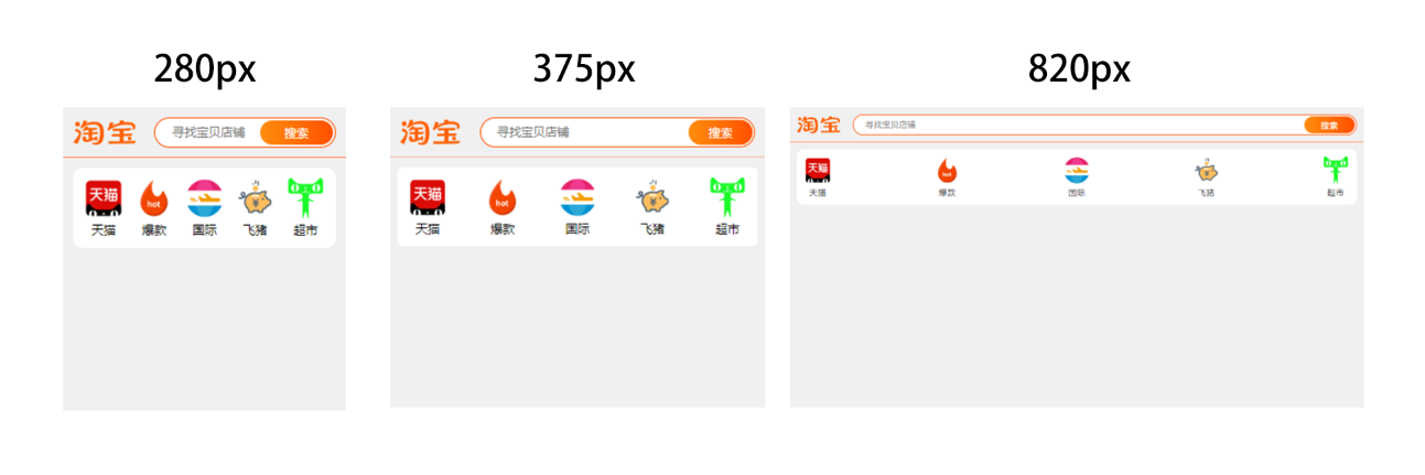
- 目前使用最普遍的方案, 当然其他的方式也一样可以使用弹性布局进行布局, 程序解决问题不是单一手段, 而是看项目来进行搭配
- 实现的思路:按正常设备尺寸编写,通过弹性布局的特性做等比分配和剩余空间分配,再结合css calc的计算函数, 适用于不要求1比1还原设计稿的
- 优点:简单、快捷、能适应90%以上移动端常用设备尺寸, 特殊尺寸再使用媒体查询写即可
- 缺点:超小设备有挤压感、大设备有空缺,因为主要使用弹性布局做空间分配,在不同尺寸设备无法 1比1 根据尺寸还原设计稿、 应对平板等特殊设备得配合媒体查询 或者 另立项目
<!DOCTYPE html>
<html lang="en">
<head>
    <meta charset="UTF-8">
    <title>弹性布局适配</title>
    <meta name="viewport" content="width=device-width,initial-scale=1,minimum-scale=1,maximum-scale=1,user-scalable=no,viewport-fit=cover">
</head>
<style>
     * { box-sizing: border-box;}
     body { margin: 0; padding: 0; background: #f0f0f0;}
    .page { width: 100%;}
    .header { width: 100%; height: 50px; display: flex; padding: 10px; justify-content: space-between; border-bottom: 1px solid coral;}
    .header .logo { height: 30px; width: 62px; padding: 3px 0;}
    .header .logo img { width: 100%; height: 100%;}

    .header .search { width: calc(100% - 80px); position: relative;}
    .header .search input { width: 100%; height: 30px; font-size: 12px; border-radius: 20px; border: #FF5000 1px solid; text-indent: 15px;}
    .header .search div { background: linear-gradient(to right, #FF8D0E, #FF5000); color: #fff; border-radius: 32px; width: 72px; height: 24px; position: absolute; right: 3px; top: 3px; text-align: center; line-height: 24px; font-size: 12px;}

    .list { display: flex; justify-content: space-between; width: calc(100vw - 20px); margin:10px auto; padding: 10px; background: #fff; border-radius: 10px;}
    .list .item { width: 40px; text-align: center; font-size: 12px;}
    .list .item img { width: 40px; height: 40px;}
</style>
<body>
<div class="page">
    <div class="header">
        <div class="logo">
           <img src="https://gw.alicdn.com/imgextra/i4/O1CN019XWXNq1aAPOVMYSiu_!!6000000003289-2-tps-167-63.png" />
        </div>
        <div class="search">
           <input placeholder="寻找宝贝店铺" />
           <div>搜索</div>
        </div>
    </div>
    <div class="list">
        <div class="item">
            <img src="https://masteryi-localhost.oss-cn-hangzhou.aliyuncs.com/blog/article/9/1.png" />
            <span>天猫</span>
        </div>
        <div class="item">
            <img src="https://masteryi-localhost.oss-cn-hangzhou.aliyuncs.com/blog/article/9/2.png" />
            <span>爆款</span>
        </div>
        <div class="item">
            <img src="https://masteryi-localhost.oss-cn-hangzhou.aliyuncs.com/blog/article/9/3.png" />
            <span>国际</span>
        </div>
        <div class="item">
            <img src="https://masteryi-localhost.oss-cn-hangzhou.aliyuncs.com/blog/article/9/4.png" />
            <span>飞猪</span>
        </div>
        <div class="item">
            <img src="https://masteryi-localhost.oss-cn-hangzhou.aliyuncs.com/blog/article/9/5.png" />__
            <span>超市</span>
        </div>
    </div>
</div>
</body>
</html>
1.3 rem 方案
- rem 单位是指根元素的font-size: px宽度 , 例如html {font-size: 16px;} 那么 1rem = 16px
- 因此这种方法的适配原理是:根据不同屏幕的宽度,以相同的比例动态修改html的font-size适配,并将px替换成rem,从而达到各种屏幕基本一直的效果体验
- 实现的方案有几种:媒体查询设置常见设备rem, css预处理器less动态设置, js动态计算
- 优点:兼容度也不错, 可以根据设计稿px来直接来进行编写,无论任何分辨率(超小屏,超大屏)也会自动适应大小1比1的还原设计稿,无需采用媒体查询写多套减少代码量
- 缺点:在奇葩的dpr设备上表现效果不太好,比如一些华为的高端机型用rem布局会出现错乱, 使用iframe引用也会出现问题
<!DOCTYPE html>
<html lang="en">
<head>
    <meta charset="UTF-8">
    <title>rem适配</title>
    <meta name="viewport" content="width=device-width,initial-scale=1,minimum-scale=1,maximum-scale=1,user-scalable=no,viewport-fit=cover">
</head>
<style>
    * { box-sizing: border-box;}
    body { margin: 0; padding: 0; background: #f0f0f0; }
    .page { width: 750rem;}

    .header { width: 750rem; height: 100rem; display: flex; padding: 20rem; justify-content: space-between; border-bottom: 1rem solid coral; }
    .header .logo { height: 60rem; width: 120rem; padding: 5rem 0;}
    .header .logo img { width: 100%; height: 100%;}

    .header .search { width: 550rem; position: relative;}
    .header .search input { width: 100%; height: 60rem; font-size: 24rem; border-radius: 40rem; border: #FF5000 2rem solid; text-indent: 30rem;}
    .header .search div { background: linear-gradient(to right, #FF8D0E, #FF5000); color: #fff; border-radius: 32rem; width: 128rem; height: 50rem; position: absolute; right: 5rem; top: 5rem; text-align: center; line-height: 50rem; font-size: 24rem;}

    .list { display: flex; justify-content: space-between; width: 720rem; margin:20rem auto; padding: 20rem; background: #fff; border-radius: 10rem;}
    .list .item { width: 80rem; text-align: center; font-size: 24rem;}
    .list .item img { width: 80rem; height: 80rem;}
</style>
<body>
<div class="page">
    <div class="header">
        <div class="logo">
            <img src="https://gw.alicdn.com/imgextra/i4/O1CN019XWXNq1aAPOVMYSiu_!!6000000003289-2-tps-167-63.png" />
        </div>
        <div class="search">
            <input placeholder="寻找宝贝店铺" />
            <div>搜索</div>
        </div>
    </div>
    <div class="list">
        <div class="item">
            <img src="https://masteryi-localhost.oss-cn-hangzhou.aliyuncs.com/blog/article/9/1.png" />
            <span>天猫</span>
        </div>
        <div class="item">
            <img src="https://masteryi-localhost.oss-cn-hangzhou.aliyuncs.com/blog/article/9/2.png" />
            <span>爆款</span>
        </div>
        <div class="item">
            <img src="https://masteryi-localhost.oss-cn-hangzhou.aliyuncs.com/blog/article/9/3.png" />
            <span>国际</span>
        </div>
        <div class="item">
            <img src="https://masteryi-localhost.oss-cn-hangzhou.aliyuncs.com/blog/article/9/4.png" />
            <span>飞猪</span>
        </div>
        <div class="item">
            <img src="https://masteryi-localhost.oss-cn-hangzhou.aliyuncs.com/blog/article/9/5.png" />
            <span>超市</span>
        </div>
    </div>
</div>
</body>
<script>
    /**
     * @effect 自动适配
     * @param {number} width 设定满屏宽度
     */
    function adapterFc(width){
        let render = () => {
            document.documentElement.style.fontSize = `${document.documentElement.clientWidth / width}px`;
        }
        render();
        window.onresize = () => render()
    }
    adapterFc(750);
</script>
</html>
1.4 Grid 栅格布局
- 百分比布局,把页面宽划分为12块, 更细一点的24块, 再通过媒体查询的配合进行设备适配,这种布局方式基本上所有的ui框架都会携带, 对弱网环境有要求不想引大的UI库,也可以自行使用display:grid
- 优点: 简单,快捷,适用于后台系统等对设计稿还原度要求不高的
- 缺点: 对设计稿还原度要求高的无法一比一还原

2. 结尾
基本没有特定的某种完美方案,主要看项目的针对群体和内容再来进行选择和组合是最好的。 上述也只是例举一些解决思路,灵活一点,不要局限自己。也许明年这些方案就都被淘汰了又会出现新的替代品